When Claude makes a change in InDesign, it likes to look at the result—the same way you’d glance at the page after nudging a frame. Until now, that glance was exactly that: a whole-page view, at a fixed, fairly coarse resolution. Good enough to confirm “yes, the block moved” or “the headline is roughly where I asked.” Not good enough to confirm “is this exactly right?”—because the details that decide right are small. A caption’s spacing. A hairline rule. Whether the logo in the corner is the new one. What’s actually visible inside an image frame.
Sidekick can now look much closer. Three changes, all about seeing the document the way it really is.
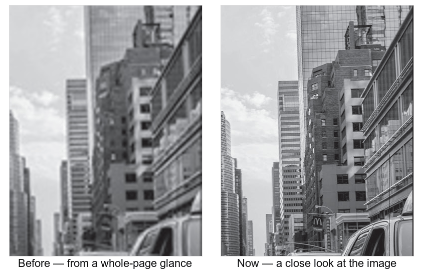
A detail from one of the photographs in our alt-text example: how Claude saw it in the old whole-page glance (left), and how it sees it now (right). Same picture—but only one of them is enough to read, proof, or trust.
Sharper, more useful views
A page snapshot now renders at the resolution Claude can actually make use of, instead of throwing detail away. The practical effect: text that used to look aliased is legible, fine rules read as fine rules, and Claude can trust what it sees rather than squinting at a blurry approximation. The same glance, but in focus.
Zoom into any part of a page
Sometimes the whole page is the wrong frame. If Claude needs to check the kerning in a headline, the join where two images meet, or the small print in a footer, it can now zoom into just that region—and that crop is re-rendered sharply from the layout, not enlarged from a blurry whole-page image. It’s the difference between holding the page at arm’s length and leaning in with a loupe.
Inspect a single element on its own
Claude can also capture one element by itself—a specific image or frame—exactly as it sits on the page. That matters more than it sounds, because an image on a page is rarely the whole image file: it might be cropped by its frame, sitting under a headline, partly covered by a shape, rotated, or masked to an oval. When Claude looks at the element, it sees what the reader sees—the visible crop, with whatever’s in front of it—not the raw asset on disk.
There’s also a lightweight “quick glance” mode for when a rough, cheap look is all that’s needed—handy when Claude is iterating and just wants to confirm something is roughly in place before zooming in for the real check.
Why it matters
Put together, this is a shift from “is something there?” to “let me look closely.” It makes a whole class of work more reliable:
- Proofing fine typography—catching the aliased em dash, the rule that’s a touch too heavy, the caption set a point too large.
- Checking placement and crops—confirming an image is cropped the way you intended, or that the new logo really replaced the old one.
- Describing images accurately—the foundation for writing good alt text, where the right description is of what’s visible on the page, not of the file. (More on that soon.)
None of this changes how you work. You still just ask Claude to take a look. It can simply look harder now—and that closer eye is what turns “the AI moved some things around” into “the AI checked its own work.”